

The Instagram Crisis That Changed My Approach
I sat in a coffee shop on a Tuesday morning, scrolling through my Instagram feed with growing dread.
For three weeks, I’d been building a lifestyle brand account using AI-generated images. The plan was simple: post twice daily with beautiful, cohesive visuals that told a story. I’d generated 60 images—sunsets, cozy interiors, minimalist workspaces. Each one looked professional. Each one performed well individually.
But together? They looked like six different people had posted from the same account.
The sunset images had warm, golden tones. The interiors were cool and moody. The workspace shots felt bright and corporate. A follower commented: “Is this a repost account? The style keeps changing.” Another asked: “Do you have a brand identity?”
My heart sank. I’d spent hours generating those images. I’d focused on quality, composition, detail. But I’d ignored the one thing that separates random content from recognizable brands: visual consistency.
That Tuesday morning, I realized creating good AI images isn’t enough. If you want to build a brand—whether it’s a social media presence, an e-commerce store, or a content business—you need every image to feel like it belongs to the same visual universe.
I spent the next month solving this problem. I studied successful visual brands. I experimented with workflows. I talked to designers and AI creators who’d cracked the consistency code.
What I learned transformed not just my Instagram account—it changed how I think about AI image creation entirely. Consistency isn’t about generating one perfect image. It’s about generating a hundred images that feel like they came from the same creative vision.
Here’s exactly how I did it—and how you can apply the same framework whether you’re building a social media brand, creating product photos for an online store, or designing marketing materials for clients.
What Does “Visual Brand Consistency” Actually Mean?
For years, I thought brand consistency meant using the same logo and colors everywhere. Slap a filter on different images, keep the text font identical, and call it a brand.
But after studying brands I admired—both traditional and AI-powered—I realized visual brand consistency runs much deeper. It’s the invisible thread that makes viewers instantly recognize an image as “yours,” even without seeing your logo.
Real visual brand consistency means:
A Cohesive Color Palette: Not just using brand colors, but maintaining consistent color temperature, saturation levels, and tonal relationships across every image. A brand that uses warm, earthy tones can’t suddenly throw in neon blues without breaking the visual language.
Recognizable Compositional Style: Whether you favor centered subjects, rule-of-thirds framing, or negative space—consistent composition creates subconscious familiarity. Viewers may not consciously notice your composition choices, but they’ll notice when an image feels “off-brand.”
Unified Lighting and Atmosphere: The quality of light—soft and diffused versus hard and dramatic, natural versus artificial, bright versus moody—defines emotional tone. Mixing lighting styles randomly creates visual whiplash.
Repeated Visual Elements: Specific textures, props, environments, or stylistic details that appear across images. Think of how Wes Anderson films always include pastel colors, symmetry, and vintage props. These recurring elements build visual vocabulary.
Consistent Level of Detail and Realism: Whether your brand aesthetic is hyperrealistic, painterly, minimalist, or stylized—maintaining this consistently matters. Jumping between photorealistic and illustrated styles confuses viewers about your brand identity.
None of these require design training. They require intentional decision-making about what your visual brand should feel like—then systematically maintaining those decisions across every image you create.
How AI Changed Visual Branding (And Made It Harder)
Here’s the paradox: AI image generators made creating professional visuals accessible to everyone, but they simultaneously made brand consistency harder to achieve.
Traditional visual branding had built-in consistency. Hire a photographer, they’d use the same camera, lighting setup, and editing presets. Work with a designer, they’d follow established brand guidelines. The limitations of traditional tools actually enforced consistency.
AI removed those constraints—which is powerful, but dangerous.
Think of it like this: traditional branding was like painting with a limited palette. You had ten colors, and everything you created used those ten. AI is like painting with infinite colors. You can create anything—but without discipline, you’ll create visual chaos.
What AI handles brilliantly:
- Generating high-quality images from text descriptions
- Creating variations on themes
- Producing images faster than any traditional method
- Adapting to different subject matter and styles
What AI struggles with:
- Remembering what “your brand” looks like without explicit instruction
- Maintaining subtle stylistic choices across separate generation sessions
- Balancing creative variation with consistent identity
- Understanding unspoken aesthetic preferences
The solution isn’t abandoning AI—it’s building systems that preserve consistency while leveraging AI’s creative power. That’s what the following framework delivers.
The 5-Step Framework for Consistent AI Brand Images
This framework took me from visual chaos to cohesive brand identity. I’ve used it to generate over 300 brand-consistent images across three different projects. Here’s exactly how it works.
Step 1: Define Your Visual DNA (30 minutes upfront)
Before generating a single image, document your brand’s visual identity in concrete terms AI can understand.
Create a simple document that defines:
- Color palette: List 3-5 primary colors (use descriptive terms: “warm terracotta orange,” “muted sage green,” “soft cream beige”)
- Lighting style: Describe preferred lighting (examples: “soft natural window light,” “dramatic side lighting with shadows,” “bright even studio lighting”)
- Mood/atmosphere: Choose 2-3 emotional keywords (“cozy and intimate,” “clean and minimalist,” “vibrant and energetic”)
- Composition preferences: Note framing choices (“centered subjects with negative space,” “dynamic diagonal compositions,” “close-up detailed shots”)
- Level of realism: Define your style point (“photorealistic,” “slightly stylized with soft edges,” “painterly and artistic”)
I spent 30 minutes defining these elements for my lifestyle brand. That half hour saved me dozens of hours regenerating inconsistent images later.
Step 2: Build Your Master Prompt Template
Transform your visual DNA into a reusable prompt template that enforces consistency.
My template looks like this:
[Subject/scene description], warm terracotta and sage green color palette,
soft natural window lighting from the left, cozy and intimate atmosphere,
centered composition with generous negative space, photorealistic style
with slightly soft edges, 35mm film aesthetic, shallow depth of field
The first part changes with each image (the subject). Everything else stays identical—that’s what creates consistency.
I save this template in a note file I can copy-paste. Every image I generate starts with this foundation.
Step 3: Use Tools That Remember Your Style
This is where most creators fail: they generate images in isolation, starting from scratch each time. Use tools that let you save and reuse style parameters.
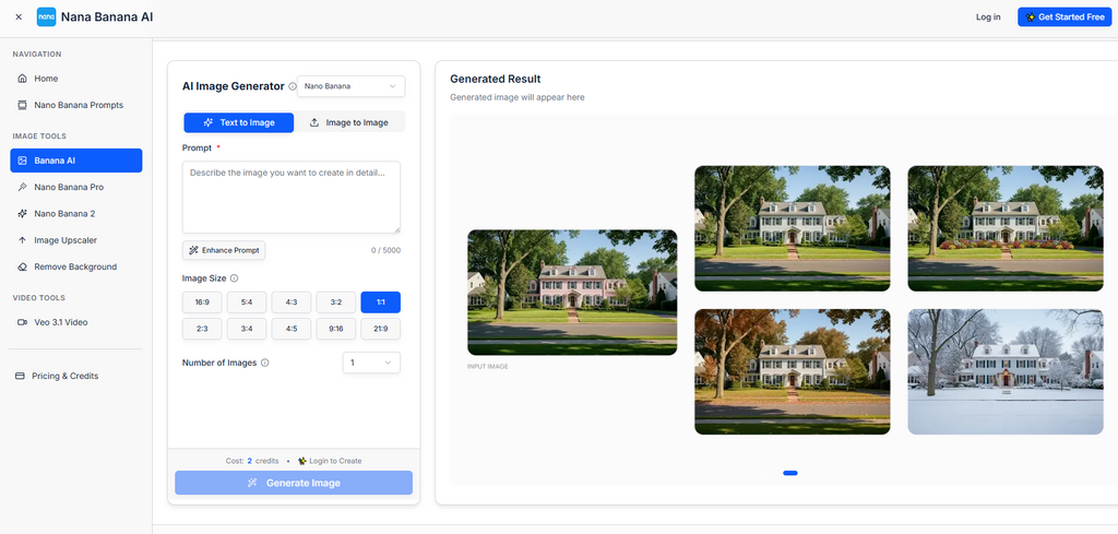
Nana Banana AI allows you to save style presets that automatically apply your visual DNA to every generation. I created a preset called “Lifestyle Brand – Cozy” that includes my color palette, lighting preferences, and compositional guidelines.
Now, instead of copying and pasting my prompt template manually, I select my preset and just describe the subject. The tool handles maintaining brand consistency automatically.
This single change reduced my generation time by 60% while improving consistency dramatically.
Step 4: Generate Test Batches and Refine
Don’t generate 100 images immediately. Create a test batch of 10-15 images covering different subjects within your brand scope.
Review them side-by-side:
- Do they look like they belong together?
- Are colors consistent across different subjects?
- Does lighting quality remain unified?
- Would someone recognize these as the same brand?
I generated 12 test images—4 sunset scenes, 4 interior shots, 4 product styling images. Reviewing them together revealed subtle inconsistencies I’d missed viewing individually. I adjusted my prompt template, regenerated, and repeated until satisfied.
This testing phase takes patience, but it prevents generating dozens of off-brand images you’ll need to discard later.
Step 5: Scale with Systematic Variation
Once your test batch proves consistency, you can scale confidently—but you need a system for introducing variation without breaking brand identity.
Create variation within constraints:
- Subject variation: Change what’s in the image (different products, scenes, activities)
- Angle variation: Shoot from different perspectives (overhead, eye-level, low angle)
- Minimal prompt adjustments: Tweak secondary elements (time of day, specific props) while keeping core style parameters fixed
I use a consistent AI image generator that lets me batch-generate variations while locking core brand parameters. I can create 20 different product shots in one session, each featuring different items, but all maintaining identical lighting, color grading, and compositional style.
The key principle: vary content, not style. Your brand identity lives in the consistent elements—lighting, color, mood, composition. Subjects can change endlessly within that framework.
Real-World Results: From Chaos to Cohesion
Let me show you what this framework delivered in practice.
Emma runs an online ceramic shop with 80 products. Before implementing this system, her product photos were inconsistent—some had warm lighting, others cool; some showed busy backgrounds, others minimalist; color tones shifted randomly.
“Customers told me my shop looked unprofessional,” she shared. “They couldn’t tell if all these products came from the same maker.”
Using this framework, Emma:
- Defined her visual DNA: “warm natural light, cream and terracotta colors, minimalist styling, soft shadows, artisanal feel”
- Built a master prompt template incorporating these elements
- Generated 100+ product images maintaining perfect consistency
Her results:
- Customer trust feedback improved—buyers commented the shop looked “professional and cohesive”
- Conversion rate increased 23% (consistent branding reduced purchasing friction)
- Time per product photo dropped from 45 minutes to 3 minutes
- Instagram engagement rose 40% (cohesive feed aesthetic attracted more followers)
“The framework didn’t just improve individual images,” Emma said. “It transformed how customers perceive my entire brand.”
Your Next Steps
Visual brand consistency isn’t about perfection—it’s about intentional, repeatable decisions that create recognizable identity.
Start with Step 1 today. Spend 30 minutes defining your visual DNA. Write it down. Be specific about colors, lighting, mood, and composition.
That single document will transform how you approach every AI image you generate. You’ll stop creating random beautiful images and start building a cohesive visual brand that people recognize, remember, and trust.
Consistency is the difference between content and brand. Now you have the framework to build both.