

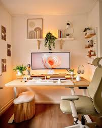
Your phone is the first thing you look at in the morning and the last thing you look at at night, and for most of us it still looks like it did in July. Bright blue wallpaper, a wall of app icons, notifications shouting over each other. Meanwhile the trees outside are doing their best impression of a cinnamon stick. Something is out of sync.
The good news is that giving your tech a seasonal makeover costs nothing, takes about an afternoon, and pays off every single time you unlock your screen. Warm colors, softer light, fewer icons, better sounds. You do not need a new device, a new desk, or a new personality. You just need a plan, and maybe a mug of something hot while you work through it.
Below are 22 practical ways to bring the fall aesthetic onto your phone, your desk, and your home screen, from wallpaper choices down to the way your workspace lamp is angled. Pick five, do them today, and save the rest for the first truly gray weekend of the season.
1. Pick a Fall Wallpaper That Is Actually Quiet
The mistake most people make is choosing a busy photo of a forest in full color. It looks wonderful for about six seconds, and then your app icons disappear into the leaves. A good fall wallpaper has one focal point and a lot of empty space: a single maple branch against a foggy sky, a close crop of a knit sweater, a plain terracotta gradient with a slight grain.
Look for images where the bottom two-thirds are relatively plain, because that is where your icons live. If you love a busy photo anyway, open it in your phone’s editor, drop the exposure a little, and add a soft blur. The mood survives, the clutter does not.
2. Give Your Lock Screen and Home Screen Different Jobs
Your lock screen is the one you glance at fifty times a day without unlocking, so it can afford to be the pretty one. Use the detailed photo here: the misty lake, the pile of pumpkins on a porch, the golden hour in the park. Your home screen, by contrast, has to share space with icons and widgets, so give it the calmer gradient or texture.
Keep the two in the same color family so the transition feels like walking from one room into the next rather than switching channels. Burnt orange lock screen, warm taupe home screen. Deep plum lock screen, soft mushroom home screen. That kind of pairing.
3. Build a Three-Color Palette and Stick to It
Fall is not one color, it is a small family of them. Choose three: one deep (forest green, oxblood, espresso), one mid-tone (rust, mustard, camel), and one light neutral (cream, oatmeal, pale sand). Write the hex codes in your notes app so you can reuse them across wallpapers, widget backgrounds, and even your desk accessories.
Once you have the trio, every decision gets easier. Widget color? Mid-tone. Text color? Deep. Wallpaper base? Light neutral. Your phone starts to feel designed instead of decorated, and that is the whole difference between cozy and cluttered.
4. Swap App Icons for Warm, Matte Versions
Both major phone platforms now let you create custom icons or apply icon packs, and this single change does more for the fall aesthetic than anything else on this list. Look for sets described as matte, muted, earthy, or minimal line art. Avoid glossy or neon sets; they fight with everything else you are about to do.
You do not have to replace all sixty icons. Do the dock and the first page only, which is maybe twelve apps. Anything on page two or in the app library can stay factory-standard, because you will rarely see it.
5. Shrink Your Home Screen to One Page
A cozy space is an uncluttered one, and that applies to screens too. Move everything you have not opened in two weeks into folders or the app library. Aim for a single home page with your dock, one or two widgets, and no more than eight loose icons.
The empty space you create is not wasted. It lets the wallpaper breathe and turns your phone from a control panel into something closer to a well-set table. If the thought of hiding apps makes you nervous, remember that search exists and takes half a second.
6. Use Widgets as Seasonal Decoration
Widgets are where the fall mood gets specific. A large photo widget showing a rotating album of your own autumn shots. A weather widget styled in your palette that quietly tells you it is sweater weather. A calendar widget with the month name in a serif font. A countdown widget to the first day of a holiday break.
Most widget-customization apps let you set background color, corner radius, and font. Use your mid-tone color at about 80 percent opacity, round the corners generously, and pick one typeface for all of them. Three matching widgets beat six mismatched ones every time.
7. Change Your System Font to Something With Character
On devices that allow it, switching the system or widget font to a soft serif or a rounded sans instantly reads as autumnal. Think of the difference between a hospital sign and a handwritten menu at a cafe. You want the menu.
If your device locks the system font, apply the change where you can: widget text, lock screen clock style, and the notes app you use most. The lock screen clock alone, set to a thinner or more classic style, does surprising work.
8. Turn On Warm Display Modes on a Schedule
Your phone and computer almost certainly have a warm display or night shift setting that reduces blue light and gives the screen an amber cast. Most people leave it off or only use it late at night. In fall, try scheduling it from sunset to sunrise, then nudge the warmth slider up one notch further than the default.
The effect is subtle in a bright room and lovely in a dim one. Screens stop glowing like refrigerators and start glowing like lamps. It also tends to make your fall wallpaper look richer, because the oranges and browns deepen instead of washing out.
9. Enable Dark Mode, but Pair It With Warm Wallpaper
Dark mode on its own can feel cold and techy, all black glass and gray text. The fix is to pair it with a wallpaper in a warm dark tone: chocolate, deep olive, aubergine, or navy with a hint of brown. Suddenly the dark interface looks like a room lit by a single candle instead of a server closet.
If your device offers a tinted or themed dark mode that pulls colors from the wallpaper, turn it on. Menus and buttons will pick up your palette automatically, and the whole system starts to feel like one cohesive object rather than a stack of apps.
10. Set a Gentler Alarm and Notification Sound
You have redecorated the visuals; now do the same for the audio. Swap the default alarm for something with a slow fade-in: soft piano, a low chime, or a recording of rain that gradually builds. For notifications, choose a single short wooden or bell tone and apply it to everything, so your phone stops sounding like a pinball machine.
Then reduce the number of things that are allowed to make noise at all. Messages from real people, yes. Every shopping app that wants to tell you about a sale, no. Fewer sounds, better sounds.
11. Create a Focus Mode Called Something Cozy
Most phones let you build custom focus modes that silence certain apps, change your home screen, and alter your lock screen. Create one for evenings and name it whatever makes you smile: Cabin, Hearth, Sweater Hours. Set it to switch on automatically at 7 p.m. and off when your morning alarm rings.
Attach a dedicated home screen to it with only the essentials: a reading app, a music app, messages, a notes app, and a large photo widget. When the mode kicks in, your phone visibly changes gears, which is a small but real cue to your brain that the workday is over.
12. Give Your Desk a Fall Backdrop Too
Your laptop or monitor is a much bigger canvas than your phone, so the wallpaper rules change slightly. Wide, horizontal compositions work best: a road lined with trees, a low field at dusk, a rainy window from the inside. Choose an image with a clear horizontal band of calm where your desktop icons and taskbar sit.
If you use multiple monitors, pick two photos from the same shoot or the same photographer so they share a light quality, or use a single panoramic image stretched across both. And clear the desktop itself. Six icons, tops. The rest goes into a folder named, honestly, whatever gets you to actually put things in it.
13. Match Your Physical Desk to Your Digital One
Once your screens are warm and calm, a black plastic mouse pad and a fluorescent sticky-note pile will look wrong. Swap in a desk mat in cork, felt, or a tan leather-look material. Trade the neon sticky notes for kraft paper ones. Put your pens in a ceramic cup instead of a wire mesh holder.
None of these need to be expensive. The goal is to bring the same three-color palette from your phone onto the desk, so when you look up from the screen, the room agrees with it.
14. Get Your Workspace Lighting Right
Lighting is the single most powerful fall aesthetic tool for a workspace, and the rule is simple: multiple low, warm sources instead of one bright overhead. A desk lamp with a 2700K bulb angled at the wall behind your monitor reduces eye strain and creates a soft halo around your screen. Add a small lamp or a warm LED strip behind the desk for a second layer.
If you have smart bulbs, set a scene that comes on automatically at dusk: 2700K, around 40 percent brightness, with the strip behind the monitor slightly dimmer than the desk lamp. Turn the overhead light off entirely after sunset. Your video calls will also look better, which is a nice bonus.
15. Add One Living Thing and One Scented Thing
A desk plant that tolerates low autumn light (a pothos or a snake plant will forgive almost anything) adds a note of green to all the warm tones and keeps the setup from feeling like a furniture catalog. Water it on Sundays and forget about it otherwise.
For scent, a small candle or a reed diffuser in cedar, amber, clove, or black tea placed at the far corner of the desk is enough. Light the candle when you start work and blow it out when you close the laptop. It becomes a ritual bookend for the day, and it makes your desk smell like a place you want to be.
16. Build Playlists by Task, Not by Mood
A single giant autumn playlist gets old fast. Instead, build three short ones tied to what you are doing. Deep work: instrumental folk, ambient piano, or lo-fi with no vocals, about 90 minutes long so it ends when your focus does. Admin and email: mellow indie or soft jazz with vocals, since the work does not need your whole brain. Wind-down: acoustic covers, slow soul, or a rainstorm recording layered under quiet strings.
Name them plainly and pin them to your music app’s home screen. Then add one new song to each per week through November, so they keep evolving with the season.
17. Choose Focus Tools That Look the Part
Focus and timer apps come in roughly three flavors. Pomodoro timers, which break work into 25-minute blocks with short breaks. Ambient sound apps, which let you mix rain, fireplace crackle, and cafe murmur to taste. And gentle blockers, which lock distracting sites for a set window.
Whichever category you use, choose one whose interface you can theme in warm tones or dark mode. Set the Pomodoro timer to a soft chime rather than a buzzer, and mix your ambient sound so the fireplace sits just under the rain. If you work with a physical timer instead, a small wooden hourglass on the desk does the same job with more charm.
18. Photograph Fall in the Right Light
If you want your own photos on your lock screen, timing matters more than gear. Shoot in the hour after sunrise or before sunset when light is low and gold. Overcast days are the secret weapon, though: soft, even light makes reds and oranges glow without harsh shadows, and puddles double as mirrors.
Get close. A single leaf on wet pavement, a hand holding a cup with steam, a corner of a plaid scarf. Tight shots translate to phone wallpapers far better than wide landscapes, and they hide the parking lot behind the pretty tree.
19. Edit Fall Photos With a Light Hand
The fastest way to ruin an autumn photo is to crank the saturation until the leaves look radioactive. Instead, in your phone’s built-in editor, try this sequence: drop the highlights slightly, raise the shadows a touch, pull warmth up by a small amount, and then reduce overall saturation by a few points while nudging vibrance up. That combination keeps the colors rich but believable.
Add a light vignette, a hint of grain if your editor offers it, and slightly lower the contrast for a softer, film-like finish. Save the recipe as a preset if your app allows, so every shot this season gets the same treatment and your wallpaper rotation looks like a set.
20. Set Up a Rotating Wallpaper Album
Once you have a dozen good fall shots, put them in a dedicated album and point your lock screen’s shuffle feature at it. Set it to change on each wake or once an hour. A wallpaper that changes gently through the day keeps the season feeling alive rather than static.
Refresh the album every couple of weeks as the trees progress from green-gold to full color to bare branches. Early fall gets the sunny shots, late fall gets the moody ones. By the time it is bare and gray outside, your phone will have quietly followed along.
21. Do a Digital Declutter as a Seasonal Reset
Spring is the traditional season for cleaning, but fall is when we actually spend more time indoors with our devices, so it makes more sense here. Set aside one evening. Delete apps you have not opened since summer. Unsubscribe from ten newsletters. Clear your downloads folder. Archive the group chats that stopped being fun in August.
Then tackle photos: pick the best twenty from summer, put them in an album, and let the other four hundred near-duplicates go. Your phone will feel lighter, and your fall wallpapers will not be buried under beach photos when you go looking for them. The team at WellnessZing makes a similar point in their seasonal guide: getting in the mood for fall is mostly about clearing space, not buying things.
22. Make One Small Cozy Change Each Week
You do not have to do all of this in a weekend, and honestly it is nicer if you do not. Pick one item from this list every Sunday evening: this week the wallpaper, next week the notification sounds, the week after the desk lamp. By Thanksgiving your setup will have shifted completely, and each change will have had time to feel like yours.
Keep a short note of what you changed and when. It sounds fussy, but come next September you will be glad to have a checklist instead of starting from scratch. Cozy is a habit more than a look.
A Warmer Screen for a Colder Season
None of these ideas are about making your phone or your desk look like a catalog. They are about making the tools you use all day feel a little more like the season you are living in. Warm light, calm colors, fewer pings, better sounds, and a wallpaper that reminds you to look out the window once in a while.
Start with the two or three that made you nod while reading. The rest of the fall aesthetic will follow at its own pace, one unlock at a time.
