

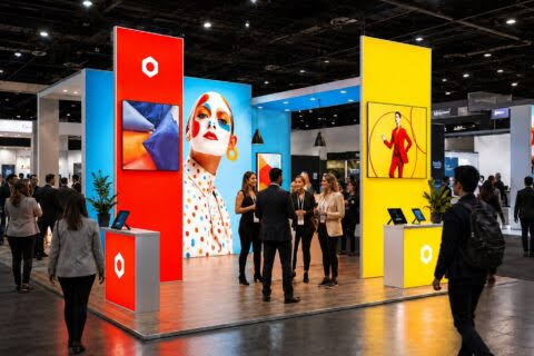
Trade show floors are chaotic environments where thousands of attendees move quickly between booths, stopping only when something captures their attention instantly. Within that critical three-second window, your display must communicate a single, unmistakable message or risk being forgotten completely. The most successful trade show displays understand this constraint and use it as a design principle rather than a limitation. This approach separates booths that generate meaningful leads from those that blend into the background noise of the event.
1. Understanding the Three-Second Rule in Trade Show Design
The three-second rule exists because trade show attendees operate under time pressure and decision fatigue. Walking a large trade show floor, attendees encounter hundreds of booths competing for attention simultaneously. Most people spend only three to five seconds deciding whether a display is worth stopping for, which means your booth must communicate its core value proposition immediately. This is not a suggestion for optimization; it is the fundamental reality of how human attention works in high-stimulation environments.
Visual hierarchy becomes your most powerful tool within this constraint. The human eye naturally processes information in a specific order, and successful displays exploit this by placing the most critical message at the dominant visual focal point. When a potential customer glances at your booth, their eyes should land on the single most important thing you want them to know. For example, if you are promoting a new software solution that reduces operational costs, the dominant visual element should convey that message in plain language before the eye moves to supporting details or company logos.
2. Crafting a Single, Unmistakable Message
One message does not mean one word or one sentence. It means one core idea that can be understood without effort or interpretation. The message should answer the question that attendees are asking themselves as they walk the floor: “What is this company doing that matters to me?” If your message requires the attendee to piece together information or make connections themselves, you have already lost the three seconds.
Testing your message with people who know nothing about your company is a critical validation step. Ask them to glance at your display for three seconds, look away, and then tell you what they think the booth is about. If their answer does not match your intended message, your display is not communicating effectively. This simple exercise reveals whether your message is actually clear or simply seems clear to you because you already know what you do. Refining your message based on this feedback typically results in displays that perform measurably better in lead generation and booth traffic.
3. Visual Simplicity as a Competitive Advantage
Cluttered displays fail because they force attendees to work too hard to understand what they are looking at. Trade show floors reward simplicity and penalize complexity. The most effective displays contain substantial white space, minimal text, and a single strong visual that supports the core message. This might sound restrictive, but it is actually liberating because it eliminates the endless debate about what content to include and forces teams to commit to what truly matters.
Large, legible typography is non-negotiable because small text forces people to step closer and spend more time reading. If attendees must move into your booth to read your primary message, you have already lost the three-second advantage. Font sizes should be scaled for viewing from ten to fifteen feet away, which typically means your main headline should be at least thirty-six points or larger, depending on the font choice. Supporting details can be smaller, but anything a visitor needs to understand immediately should be sized for comfortable reading from a distance.
Color choice also plays a functional role in message communication. Bold, contrasting colors create visual impact and guide the eye to your primary message, while muted or busy color combinations can obscure your intended focal point. The color palette should reflect your brand identity while prioritizing readability and visual hierarchy over aesthetic complexity. When someone glances at your booth from across the trade show floor, the color strategy should work in coordination with typography and layout to guide their attention directly to your core message.
4. Strategic Use of Imagery and Demonstrations
An image or live demonstration can communicate complex information faster than text alone. For example, if your product transforms a workflow or solves a visible problem, showing that transformation visually allows attendees to grasp your value proposition instantly. A single powerful image that captures what your company does is often more effective than a dozen bulleted features. The image should depict your core message directly rather than requiring interpretation or context that viewers lack. Companies that exhibit at multiple events throughout the year often rely on trade show display rentals to maintain a fresh, professionally designed presence that supports strong visual communication without committing to a single permanent structure.
Motion and video can extend your advantage beyond three seconds if they are deployed strategically. A short looping video or animated display element can sustain attention beyond the initial glance, but the primary message must still be clear in those first three seconds before any animation even registers. Live demonstrations work well when they are simple enough to convey the core benefit within a few seconds of watching. Overly complex demonstrations confuse rather than clarify, so the best practice is to show the before and after state of a process rather than the entire technical process itself.
5. Testing and Refinement Before the Event
Waiting until the trade show to learn whether your display communicates effectively is a missed opportunity. Building a mockup or digital rendering of your booth design and testing it with sample viewers allows you to identify communication failures before investment in production and setup. Photographs of your booth design viewed on a monitor at different viewing distances and angles can reveal whether your message remains clear from multiple perspectives. Capturing reactions across varied conditions gives your team a more complete picture of how the design will perform in a real environment.
Feedback collection should focus on message clarity rather than design preferences. Ask testers whether they understood the core message immediately and whether they could articulate it accurately to someone else. This is the metric that matters for trade show performance. Iterate based on this feedback until the message comes through consistently and rapidly across different viewers. The time invested in refinement before the event typically pays dividends through improved booth traffic and lead quality during the actual trade show.
Conclusion
The highest-performing trade show displays succeed because they embrace the three-second constraint as a design principle and execute ruthlessly around that limitation. By committing to a single core message, prioritizing visual simplicity, and validating that message with real viewers before the event, you create a display that captures attention and generates meaningful conversations with trade show attendees. This approach requires discipline and often means removing elements that seem valuable but dilute your primary communication. The trade show floor rewards focus and punishes ambiguity, making the three-second rule not just a useful guideline but the foundation of effective display design. When your booth communicates one clear message instantly, you stand out from competitors and attract the visitors most likely to become qualified leads.
