

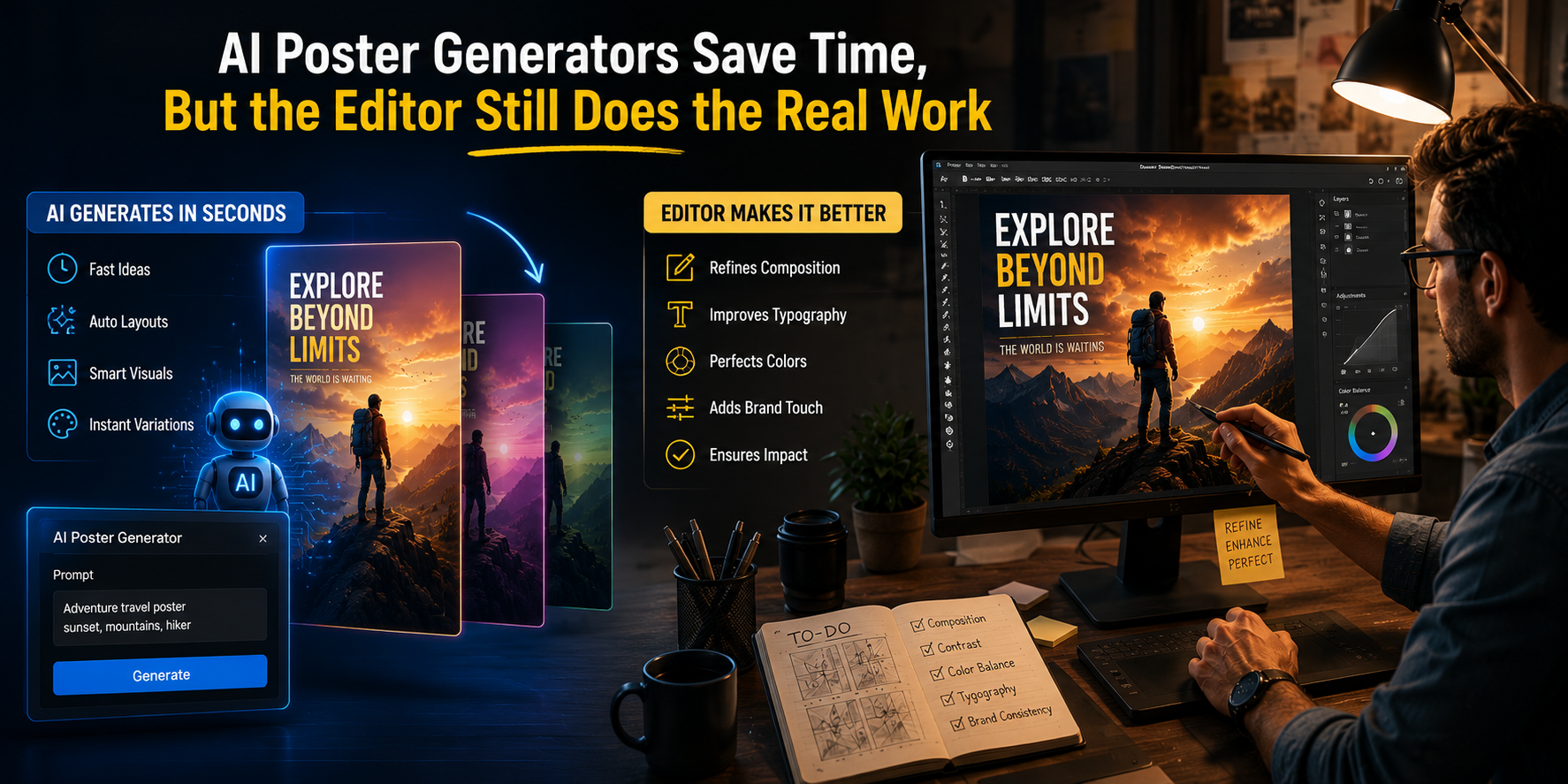
An AI poster generator can often hand back a finished-looking 1:1 design in about a minute for a text prompt of moderate specificity, say, “summer iced coffee promotion poster, warm tones, hand-drawn type”: warm tones present, hand-drawn type present, a sketched cup over a cream background, Lorem-ipsum-style filler where the headline should sit, and sometimes a barcode-shaped element the model invented next to it. The composition is usually usable as a starting point. The headline copy, the display-weight typography, the brand-specific palette, and any AI-invented decorative shapes typically need replacing.
The interesting question isn’t whether the generator works. It’s what the workflow looks like after the model hands the canvas off.
What the Generation Actually Solves
The generator earns its minute on a few specific outcomes. Composition often lands well enough: the model picks a focal element, gives the design a clear hierarchy, and creates something a team can react to. Style direction commits early. The output settles on a palette draft and a typographic vibe within seconds, even when the actual typeface chosen isn’t the right one. And the speed itself matters: what used to be an hour of layout sketching before anyone on the team could react to a concept becomes a minute of generation, which is the part of the workflow that historically delayed every other decision.
For owner-operator marketing teams in particular, this matters. The slow part of getting a poster out has rarely been willingness to ship. It’s the cost of producing the first concrete visual that a head of marketing, a head of operations, and a designer can react to in the same conversation.
What the Generator Doesn’t Solve
The headline copy often still needs rewriting or rebuilding in the editor. Many image-first generators still produce filler text or unreliable lettering, especially when the poster depends on exact campaign copy.
The brand’s licensed typography isn’t selected. The output uses a typeface that visually rhymes with the prompt vibe (friendly, modern, hand-drawn) but is rarely the licensed headline type the brand actually ships with.
The brand’s exact palette usually isn’t honored unless the tool has a brand-kit or editable design layer. The output tends to use a statistically common interpretation of “warm tones” or “navy and gold” rather than the two or three specific color stops the brand has locked.
Functional QR codes and contact data don’t come back reliably. The output sometimes invents a barcode-shaped decoration, sometimes a placeholder logo, sometimes a phone number that isn’t yours. These have to come out before the real version goes in.
In-image text accuracy is the persistent weak point. Letters get garbled at small sizes. Longer copy often comes back misspelled. Brand names tend to come back slightly off (missing letters, dropped diacritics, an extra space), and anything copy-heavy gets redrawn in the editor pass anyway.
What the Editor Pass Actually Looks Like
The pass that follows generation has a predictable shape. Replace the placeholder headline with the campaign copy. Swap the AI typeface for the brand’s headline and body type. Adjust the two or three color stops that don’t match the brand palette and leave the rest alone. Remove any AI-invented placeholder shapes. Add the real QR code, sized for the medium the poster ships on, with enough contrast against the background to scan reliably. Crop to the formats the campaign actually distributes: 1:1, 9:16, 4:5, sometimes a 16:9 banner version.
Per asset, this can be a few minutes when the base layout is strong, and longer when the generated poster fights the brand system. For a one-poster effort, the editor pass is invisible. For a ten-poster multi-format campaign, the editor pass adds up to most of an hour, and it’s where the workflow stops being fast.
Where Generation Hands Off to the Editor Decides the Real Savings
Whether the workflow actually saves time depends on more than model quality. It also depends on whether the editor sits in the same canvas as the generator.
If the generator outputs a flat PNG that has to be opened in a separate editor, the savings from generation get partly eaten by the export-and-import loop: re-creating the brand-kit application, redoing the sizing in a different layout, manually adding back the QR. The real advantage of an AI poster generator is not just the first image it produces, but whether the tool lets the editing pass happen in the same canvas.
For small marketing teams running variant-heavy campaigns, this is where the time actually shows up at the end of the week. The window-switching workflow costs a few minutes per asset; the same-canvas workflow trims much of that overhead.
For campaigns where in-image text and brand-specific typography are the entire job (type-led concert posters, dense informational flyers, anything where the copy carries more weight than the imagery), the editor pass ends up being the whole workflow, and the AI is just one possible source of starter compositions among others.
What the AI doesn’t replace is the editorial judgment of which campaign idea is worth running. The cost of trying a fifth visual direction drops sharply when the generator is producing the first layout. The question “should we run this campaign at all” still belongs to the marketer. That part of the workflow hasn’t moved.
